Portfolio
At Skagit Media, we take immense pride in showcasing our range of web design projects that reflect our passion for crafting exceptional online experiences. Explore our portfolio to discover how we’ve transformed ideas into visually stunning and highly functional websites that drive success in the digital landscape.
Fisher CGI
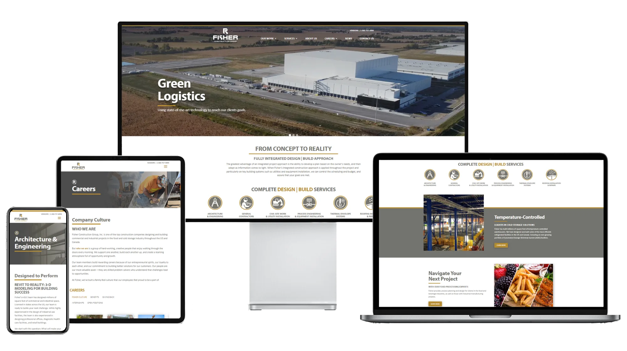
We recently had the privilege of revamping the Fisher CGI website, ushering it into the modern digital era. Our primary objective was to breathe new life into the online presence of Fisher CGI, making it more contemporary and user-friendly. One of the key aspects of this transformation was moving the call-to-action elements forward, ensuring that visitors can easily engage with the website and take the desired actions.
The updated Fisher CGI website now features a sleek, intuitive design that not only looks impressive but also enhances user navigation. We strategically placed the call-to-action buttons in prominent locations, making it effortless for visitors to request information, contact the company, or explore their services. This strategic design approach not only improves the user experience but also serves the business goals of Fisher CGI by driving more conversions and engagement. We are proud to have played a part in modernizing their online presence, helping Fisher CGI stay competitive and capture the attention of their target audience in today’s digital landscape.
Bowhill Blueberries
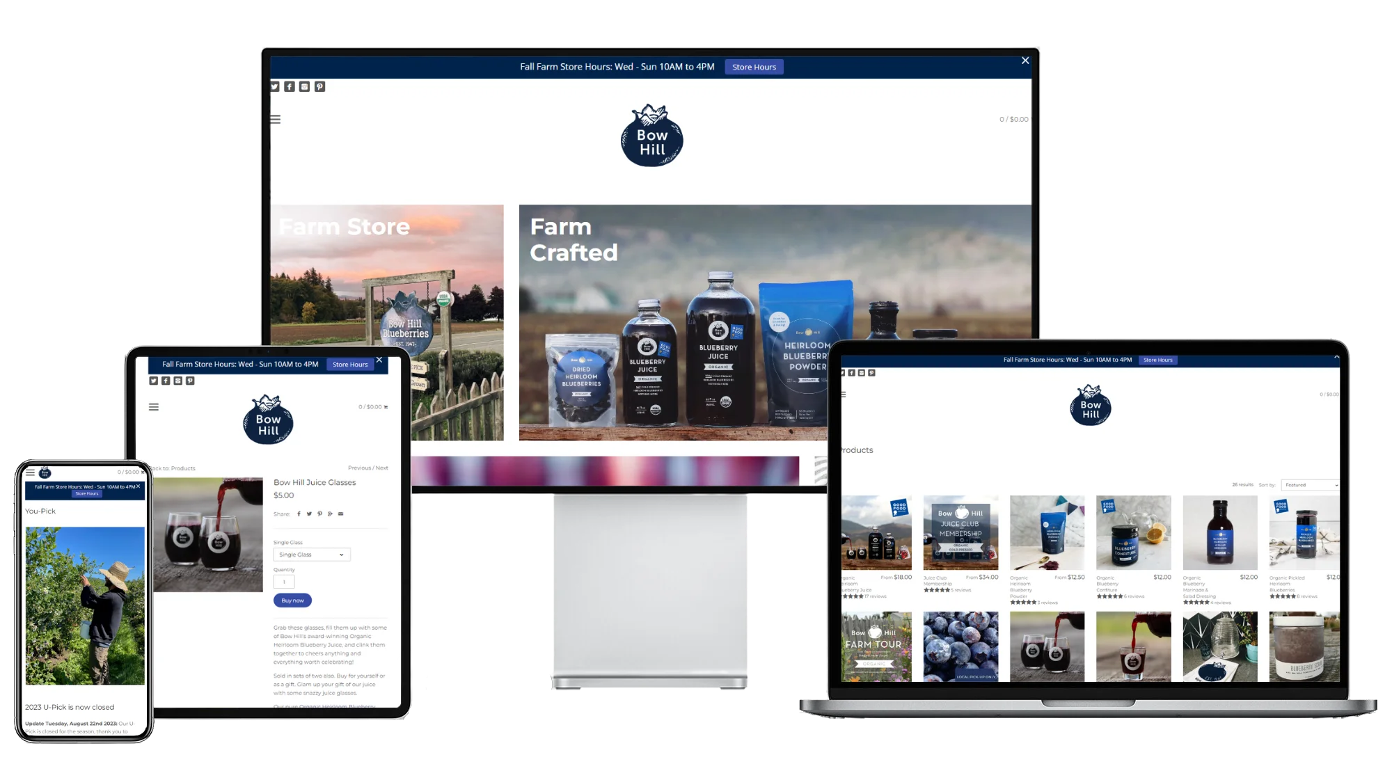
We were thrilled to partner with Bowhill Blueberries in bringing their online presence to a whole new level. Our team took on the challenge of revamping their Shopify website, with a focus on enhancing the user experience and creating a seamless connection between their delicious produce and inspiring recipes.
One of the standout features we introduced is the innovative “Produce to Recipes” integration. This feature not only showcases Bowhill Blueberries’ premium fruits but also allows customers to explore recipes that highlight these delectable ingredients. Whether you’re looking for the perfect blueberry muffin recipe or seeking inspiration for a wholesome blueberry salad, the Bowhill Blueberries website now effortlessly connects you to the culinary possibilities their products offer. This enhancement not only engages visitors but also encourages them to explore and purchase Bowhill Blueberries’ produce, making it a win-win for the business and its customers. The updated Shopify website we’ve crafted for Bowhill Blueberries truly exemplifies our commitment to combining design and functionality to create a delightful online experience for both clients and their audience.
Bay Baby Produce
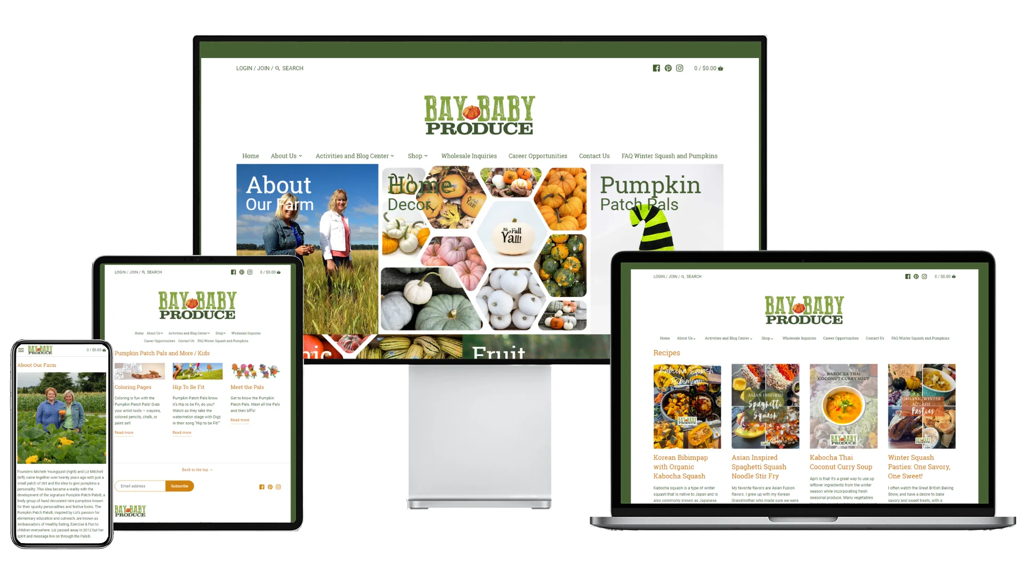
We were privileged to collaborate with Bay Baby Produce on an exciting project aimed at redefining their digital presence. Our mission was to modernize their Shopify website while addressing the distinct needs of both their wholesale and retail customers. We set out to create an online platform that seamlessly caters to these two distinct user groups, enhancing the user experience for each.
One of the standout features of the updated website is the clear separation between the wholesale and retail areas. This intuitive design ensures that visitors can easily navigate to the section that pertains to their specific needs. By implementing this feature, we’ve not only improved user satisfaction but also streamlined the management of wholesale and retail operations for Bay Baby Produce, making their Shopify website a versatile tool that serves both their business and their customers effectively. This project is a testament to our commitment to creating custom web solutions that meet the unique needs of our clients.
Samish Campfire
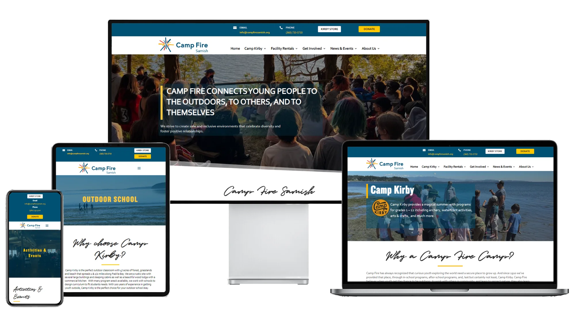
We were thrilled to work with Samish Campfire to revamp their website using WordPress and the powerful DIVI theme. The goal of this project was to create a more streamlined and user-friendly experience for their visitors by condensing content into fewer tabs while maintaining the essence of their message.
Our team carefully analyzed and organized the information on the Samish Campfire website, ensuring that it was logically grouped and accessible through fewer tabs. By doing so, we’ve simplified navigation, allowing users to easily find the information they need without unnecessary clicks. This approach not only enhances the user experience but also presents a cleaner and more visually appealing design. Samish Campfire now has a modern and efficient WordPress website that effectively communicates their mission and values while making it effortless for their audience to explore their offerings and engage with their content.
Skagit Valley College Foundation
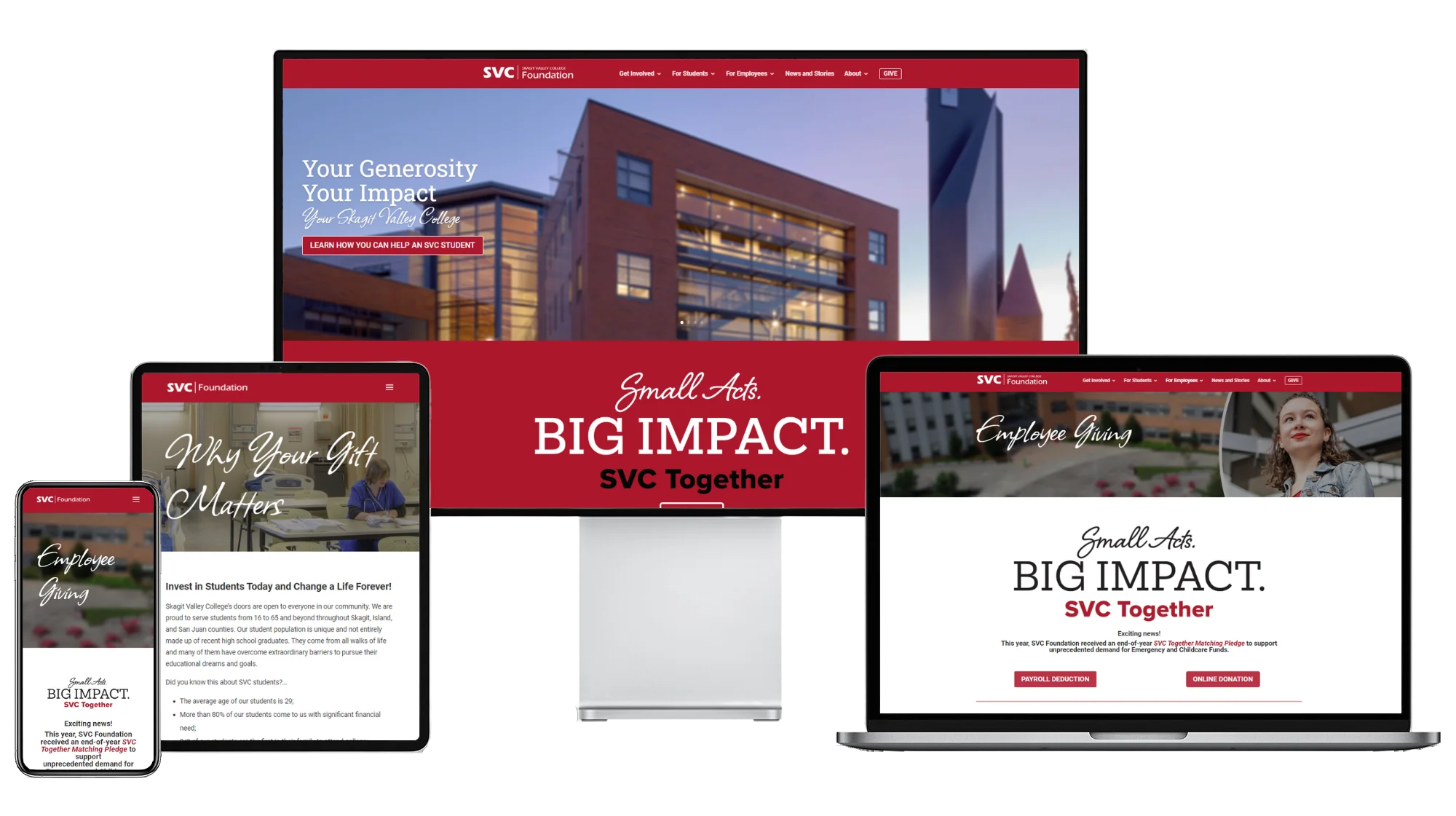
Our collaboration with Skagit Valley College Foundation was centered around enhancing their digital presence through a WordPress DIVI website. Our primary objectives were to create a consistent theme that resonated with their brand, elevate the user interface and experience (UI/UX), and provide ongoing support for their evolving needs.
We meticulously designed and implemented a cohesive theme that aligns with Skagit Valley College Foundation’s identity, ensuring that every page exudes professionalism and trustworthiness. To improve UI/UX, we restructured the website’s navigation and content layout, making it intuitive for users to find information and engage with the foundation’s mission.
Additionally, our commitment to Skagit Valley College Foundation doesn’t end with the website launch. We provide continued support to ensure their website runs smoothly and adapts to their changing requirements. This partnership allows the foundation to focus on its core mission while we take care of the technical aspects, ensuring that their online presence remains vibrant, user-friendly, and in line with their brand’s values.
Hospice of NW
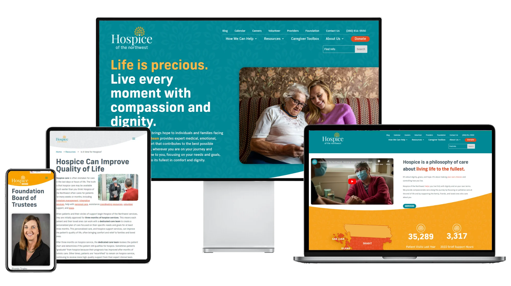
We recently had the privilege of performing a comprehensive redo of Hospice of NW’s website using WordPress and the versatile DIVI theme. One of the standout features of this project was the creation of a dedicated mini-site for the Hospice of NW Foundation, offering a separate and immersive experience for supporters and donors.
For the main website, our goal was to provide Hospice of NW with a modern, user-friendly platform that not only informs but also engages their community. We revamped the website’s design to ensure it aligned seamlessly with the organization’s values and mission, all while enhancing the user experience. The result is a visually stunning and easy-to-navigate platform that effectively communicates their services, resources, and compassionate approach to hospice care.
The addition of a full mini-site for the Hospice of NW Foundation allows them to showcase their philanthropic efforts in a dedicated space. This feature offers donors and supporters an immersive experience, allowing them to learn more about the foundation’s initiatives, make contributions, and stay updated on upcoming events.
